
A beautiful mockup isn't a website yet: why you need HTML markup

The designer sent over beautiful pictures of the future website, and everyone is thrilled. Why can't you “just upload” them to the internet—and what is the front-end developer getting paid for next? We answer in the latest article of our “IT Made Simple” series.
Spoiler: design is the blueprint, and markup is the construction. And it’s the markup that determines how the site will behave on thousands of different screens—from an old smartphone to a huge monitor.
Markup—translating the picture into the browser's language
A browser can't display a “design picture”—it reads code in special languages: HTML describes what's on the page (heading, text, button, photo), and CSS describes how it looks (colors, fonts, margins, layout). Markup is the process of translating a design mockup into this code.
The term comes from typography: typesetters used to “lay out” a newspaper page by arranging text and illustrations. The essence hasn't changed—only now the page is fluid: it has to beautifully “reflow” for any screen on its own.
By the way, the browser's third language—JavaScript—handles behavior: what happens on a click, how a menu expands, how the cart updates. The HTML + CSS + JavaScript combo is exactly the front end we talked about in our previous article.
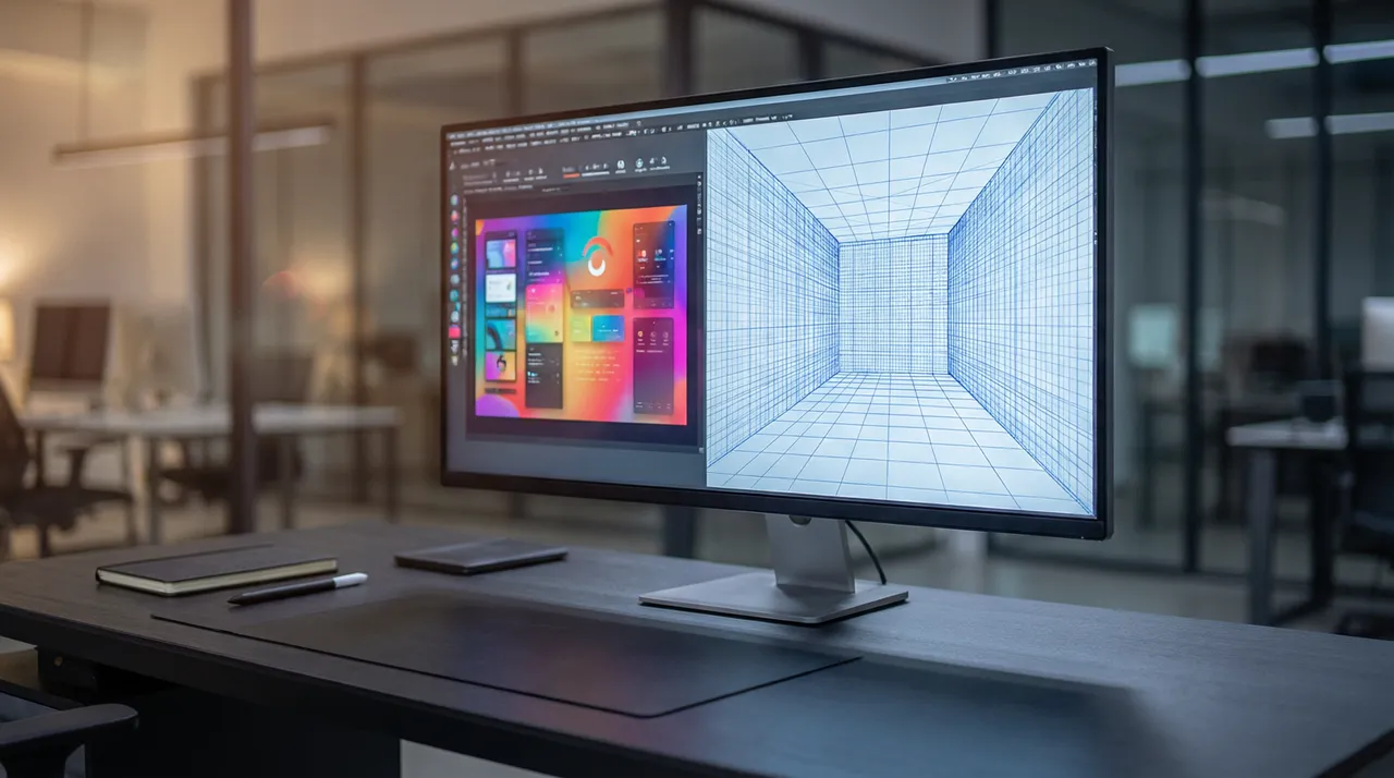
Responsiveness: one site—thousands of screens
Your site will be opened on an iPhone and a cheap Android, on a tablet and a laptop, in portrait and landscape modes. Responsive markup is the page's ability to adapt to any screen: on a monitor, products are in four columns; on a phone, in one; the menu collapses into a “hamburger”; and buttons get larger for a thumb.
Why this is critical for business: in Uzbekistan, the vast majority of visitors browse from phones. If a site is coded “for desktop,” a mobile user will see tiny text and buttons sliding off the screen—and leave for a competitor. Search engines know this: Google primarily evaluates the mobile version of a site.
That's why the modern approach is called mobile first—design the phone version first, then scale up to the desktop version. If a contractor only shows you mockups for the “wide” version, be sure to ask how it will look on a phone.

Good and bad markup: what's the difference
On the outside, two sites might look identical, but one has clean markup while the other is held together “with duct tape.” The difference shows up later: it displays crookedly on new devices, loads slowly, breaks with minor edits, and gets poorly indexed by search engines.
Quality markup isn't about perfectionism; it's about money. Load speed directly affects conversion rates and search rankings, while semantics (the correct “roles” of elements in the code) impact SEO and accessibility for people with disabilities.
- Speed: the page loads quickly even on a low-end phone and mobile internet.
- Responsiveness: nothing breaks on any screen size.
- Semantics: headings, lists, and buttons are marked up correctly—search engines “understand” the page.
- Stability: an edit in one place doesn't break adjacent blocks.
- Accessibility: the site can be read with a screen reader, elements have good contrast, and forms are labeled.
How to check the markup yourself in 10 minutes
You don't need to be a programmer to assess basic quality. Open the site on your phone and your computer. On the computer, try changing the browser window width—from narrow to wide. The content should reflow smoothly, without horizontal scrolling or text overlapping buttons.
Next, check the speed with the free Google PageSpeed Insights tool: enter the URL, and you'll get a score and a list of issues. Don't panic if the score isn't 100 (few sites get that), but a “red” zone for mobile is a reason to talk to the developer. And finally: click on everything—every button should lead somewhere, and every form should submit.


Frequently asked questions
How does markup differ from design?
Design is the visual mockup of how the site should look. Markup is the code that makes the browser display this mockup on any screen. The designer draws, the front-end developer builds. Often, one front-end developer handles both roles.
What does it mean when a “site isn't responsive”?
It's coded for a single screen size (usually desktop) and shows up on a phone as a scaled-down copy: tiny text that you have to pinch and zoom. Today, this means direct losses: most visitors are on mobile, and Google ranks based on the mobile version.
Why can't you just insert the mockup image onto the site?
An image doesn't scale to fit screens, you can't click “inside” it, search engines can't read its text, and it has a large file size. An image-only site is a beautiful but useless dummy for promotion and sales.
Are markup and “CMS integration” the same thing?
No, it’s a two-step process: first, the mockup is coded into static pages, then it’s integrated into a content management system (CMS) — so you can update text and products yourself through the admin panel. We’ll cover CMS in more detail in a separate article.